Connecting the Past with the Future
The Philosophy Behind Our Logo
Lynk is more than just a name.
The company was founded more than thirty years ago by my father, who built its foundations with vision, integrity, and dedication.
At that time, I chose a different professional path — but after his passing, I felt a deep need to return and continue the work he began.
For that reason, Lynk is much more than a rebrand.
It is the meeting point of two journeys — his, which laid the foundation, and mine, which continues the path forward.
Together, they form a link between yesterday and tomorrow, an unbroken line that connects generations, values, and vision.
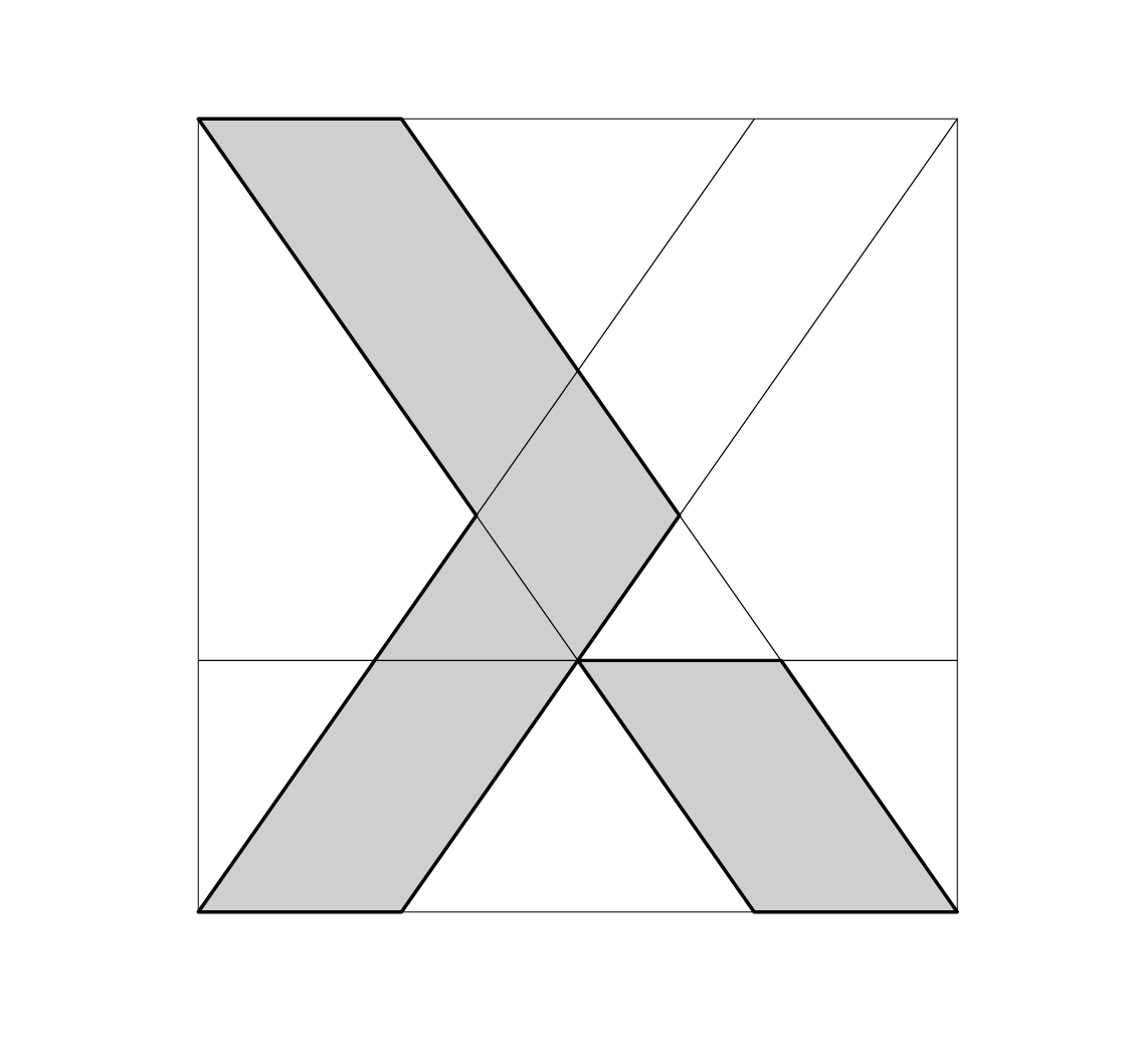
The Symbol λ
At the heart of our logo lies the lowercase Greek letter “λ” (lambda) a symbol that carries a deeply personal meaning for us.
Its two diagonal lines meet at a single point, representing the connection of two paths father’s and son's, joining into one.
That meeting point marks the moment of transition, when the father's journey found continuation through the son.
Above this point of connection, the line that extends forward symbolises the shared path into the future.
It shows that even though our paths united through loss, our story continues together not just as memory, but as a force of creation and progress.
The lowercase “λ” thus becomes a symbol of transition and continuity, a tribute to what came before and a promise for what lies ahead.
The Name Lynk
The name Lynk comes from the word link — connection.
But for us, it carries a far deeper meaning: it represents the bond between two generations, and the continuation of a story that began long before me.
The “K” is the first letter of our family name, serving as a tribute to my father, the man who began this journey.
It represents our family’s continuity, the values he instilled, and the promise to carry forward what he built with the same respect, love, and responsibility.
Together, the “λ” and the “K” form the essence of Lynk: two paths that became one — and continue moving forward into the future.
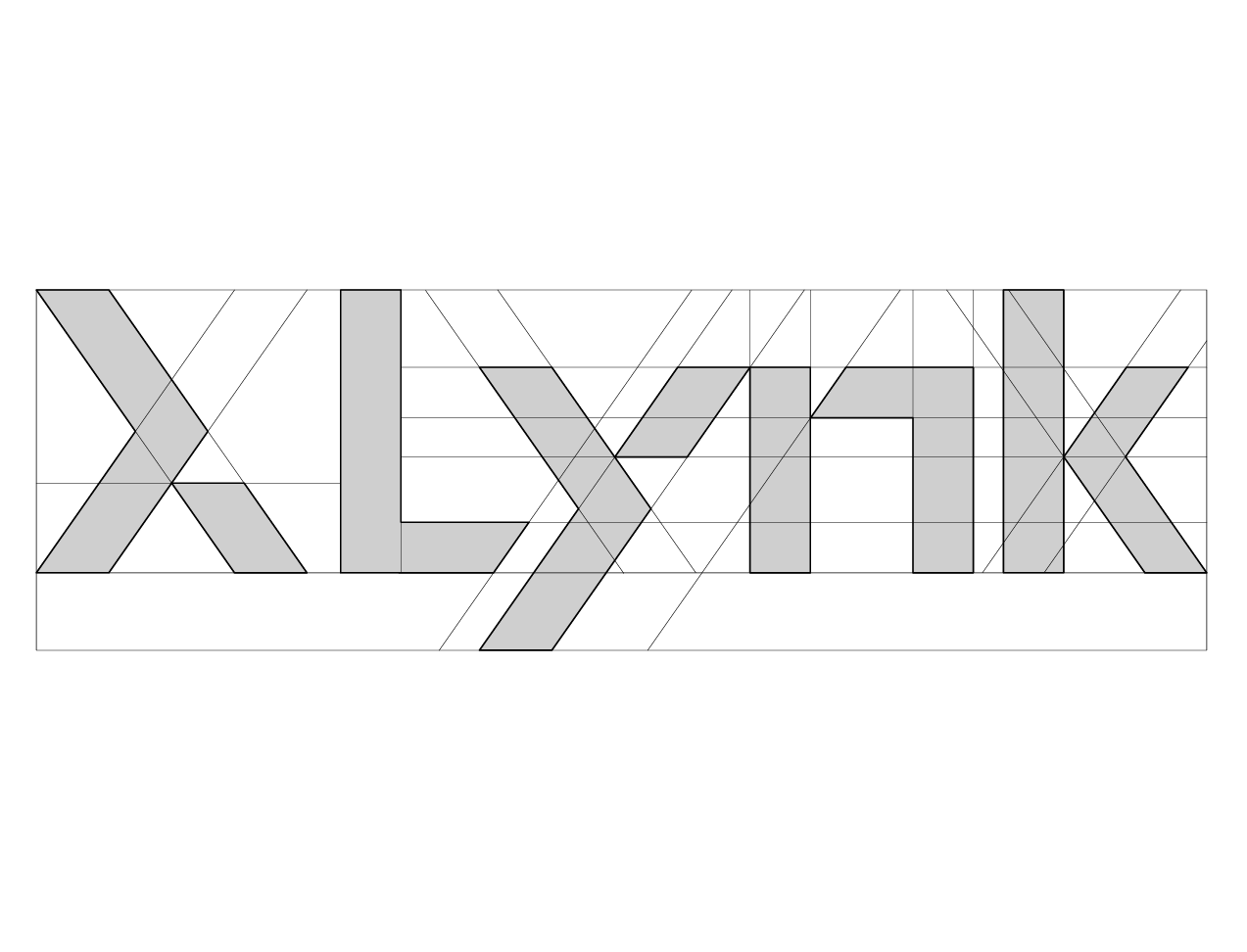
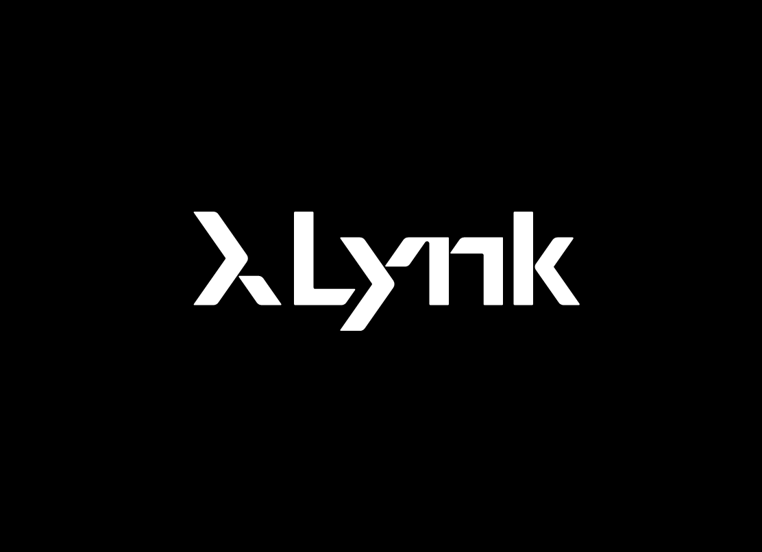
The Wordmark
The Lynk wordmark is designed with a clean, geometric, and modern typeface that blends strength and simplicity.
- The soft curves convey a human and approachable presence.
- The precise lines represent technical accuracy and professionalism.
- The flow of the letters, especially the “y”, symbolizes continuous movement and connection — the essence of our brand.
The balance between geometry and simplicity captures what Lynk stands for: technology with a human heart, a company that evolves without losing its identity.
The Message
The Lynk logo is not merely a visual mark — it is a symbol of life and continuity.
It represents two paths that united through loss, yet continue together through creation.
It is the point where memory becomes inspiration, and the past leads the future.

